01 / Overview
Redesigning a SaaS Website
for Clarity, Credibility,
and Growth
- Role
- Visual & Brand Design Lead
- Scope
- Visual direction · Website redesign · UX/UI · Front-end implementation
FlowFuse is a SaaS company that helps others deploy and manage industrial applications at scale.
Its website needed to communicate the value of the platform more clearly and convey the credibility expected by enterprise customers.
02/The challenge
It wasn’t just the website. It was the visual identity.
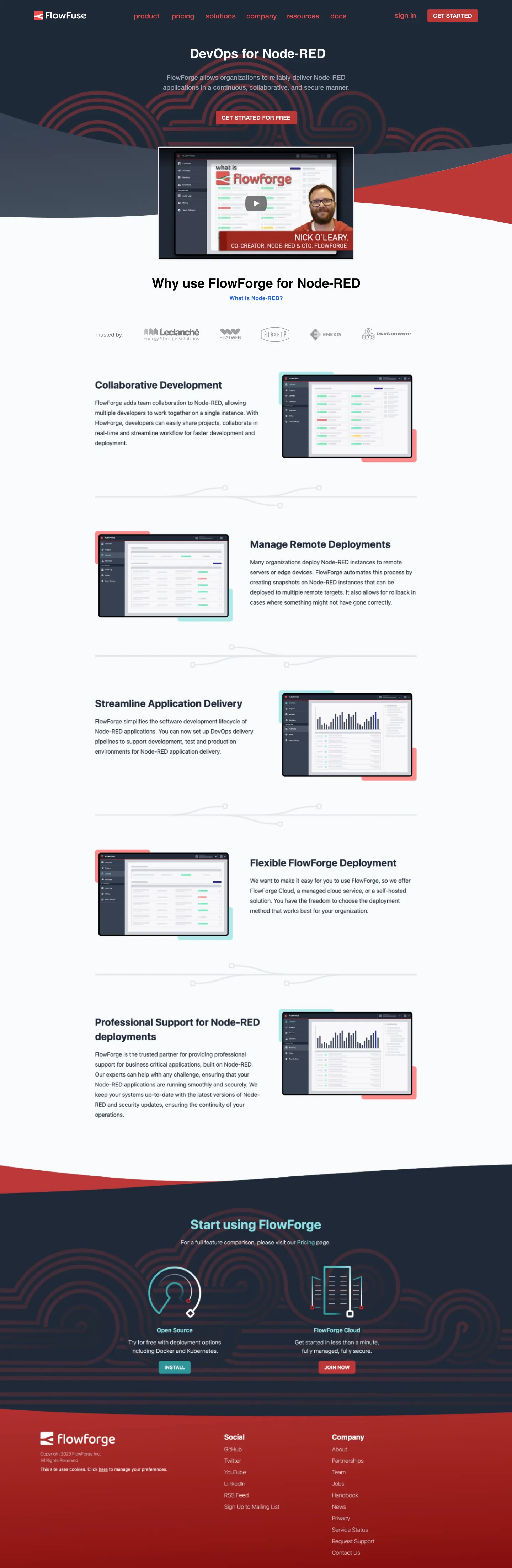
An inherited visual identity, feature-focused messaging, and lack of a clear narrative made it harder to communicate the product’s value and build trust.
Inherited color scheme
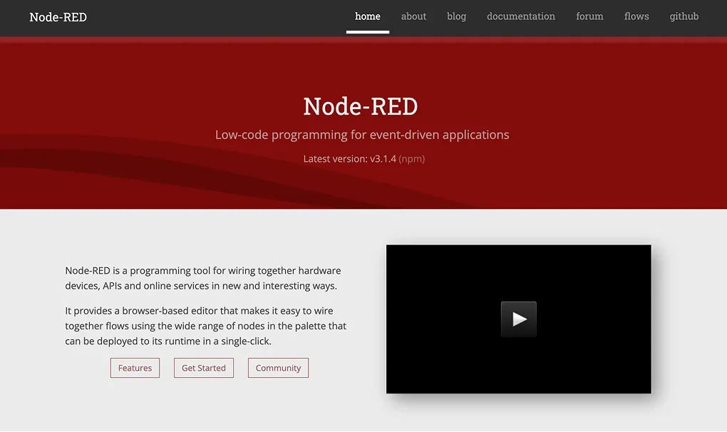
Node-RED was at the core of the product, and so were the visuals
Focused on features
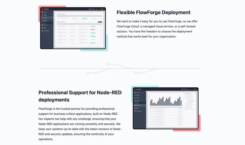
The website explained what the product did, but not who it was for
Lack of storyline
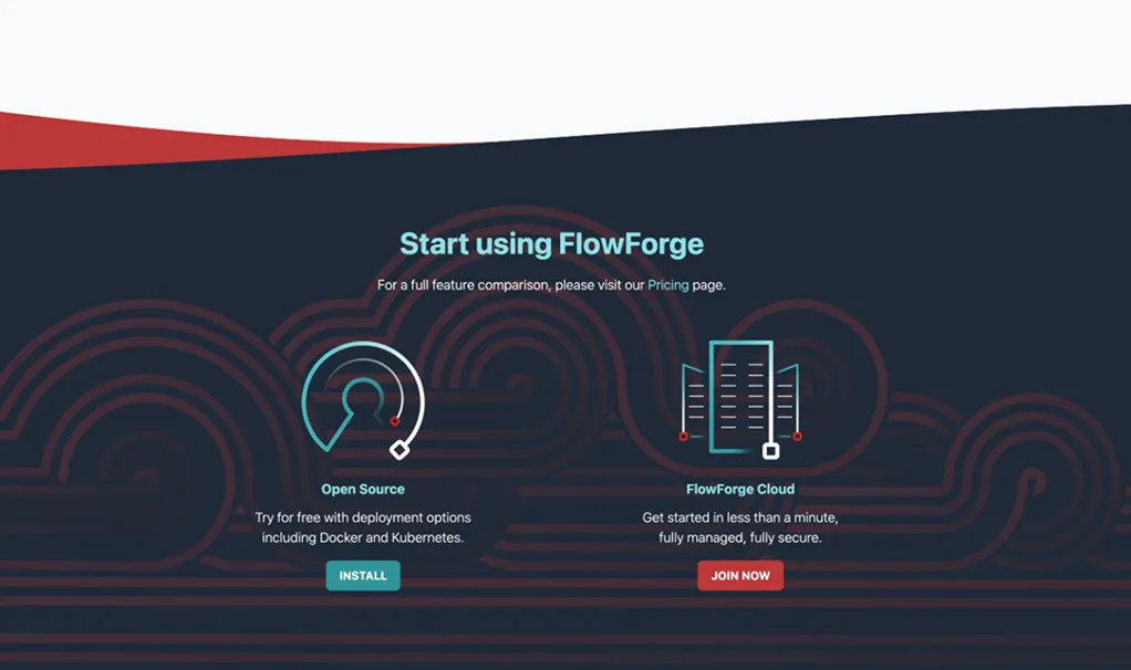
The content lacked a clear narrative to guide visitors through the product’s value
03/The approach
Take a step back, and start from the beginning
What is FlowFuse like?
- Reliable
- Approachable
- Innovative
- Dynamic
- Forward-Thinking
- Empowering
And, what else is out there?
So far, Node-RED had been guiding FlowFuse’s product and identity, but it was time to detach from that and evolve.
I benchmarked tier-one B2B SaaS platforms and competitors to identify proven patterns in visual hierarchy, information density, and enterprise value framing.
Synthesizing those benchmarks with FlowFuse’s personality formed three foundational design pillars.
Three principles guided the redesign
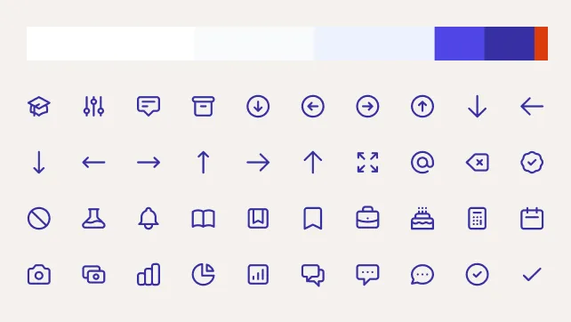
- 01
Clarity over cleverness
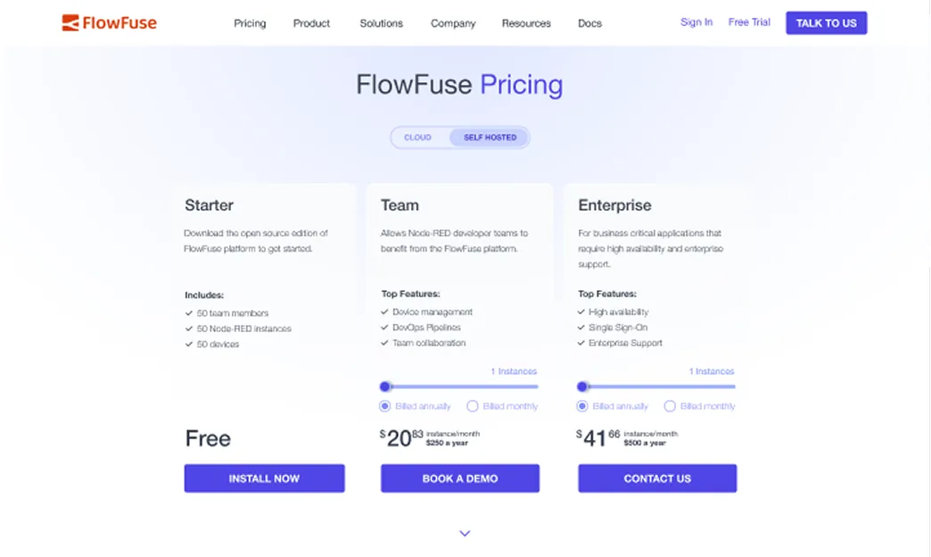
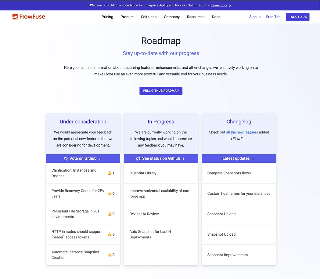
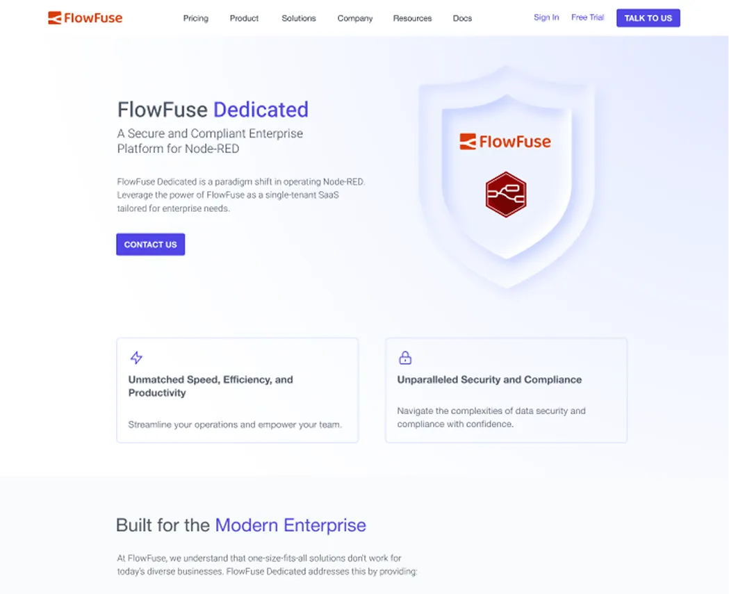
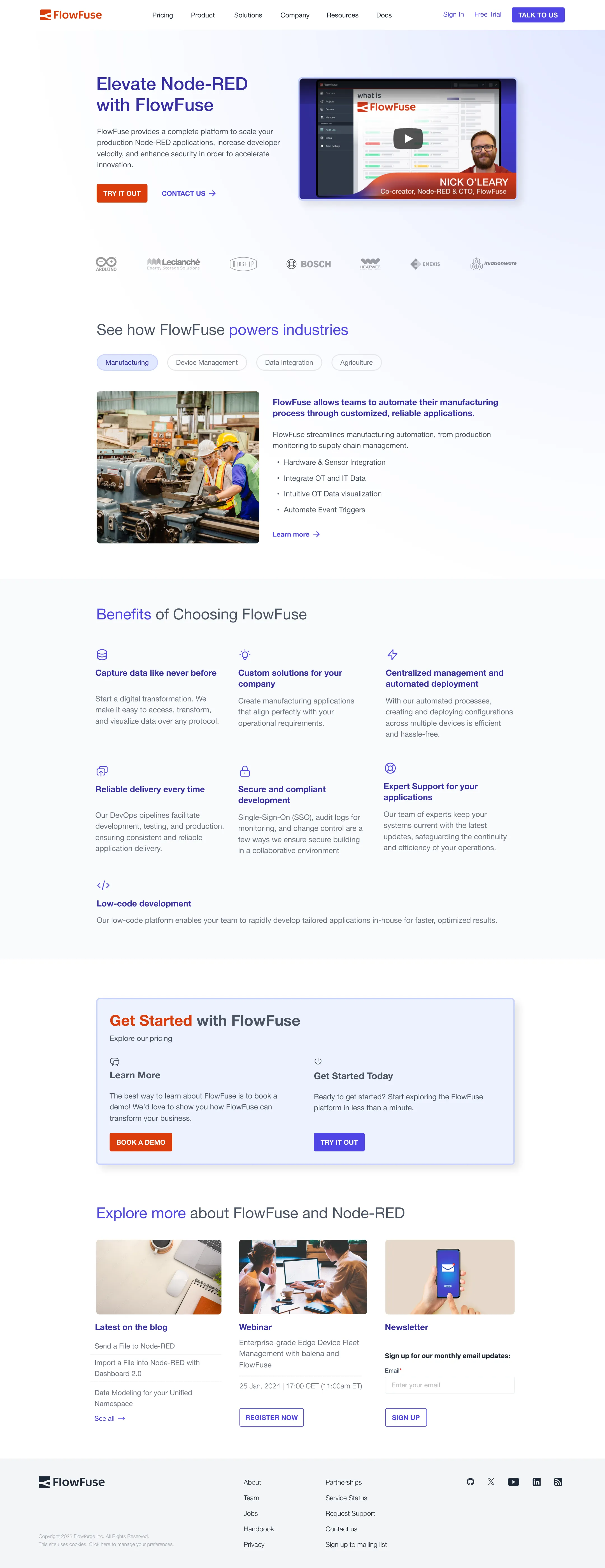
Through a new color scheme, layout components, and recognizable icons to create a more mature visual presence.
- 02
Reality over abstraction
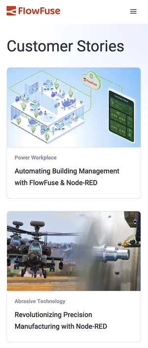
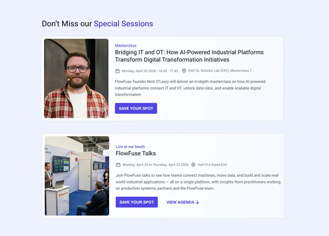
I introduced photography and real-world references to connect the platform with its users and applications.

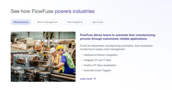
- 03
Business value over features
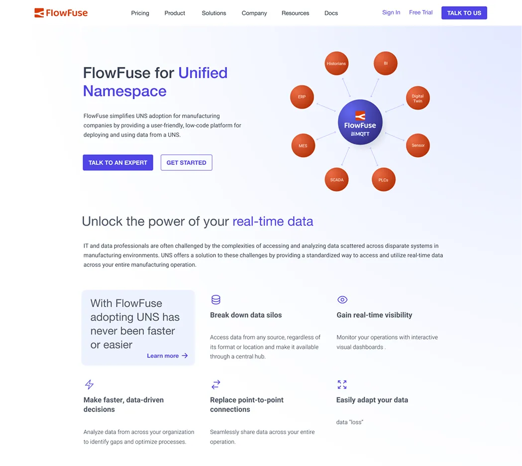
I reorganized the homepage to introduce the value proposition earlier, improve content hierarchy, and make the page easier to scan.
04/Implementation
From visual direction to production code
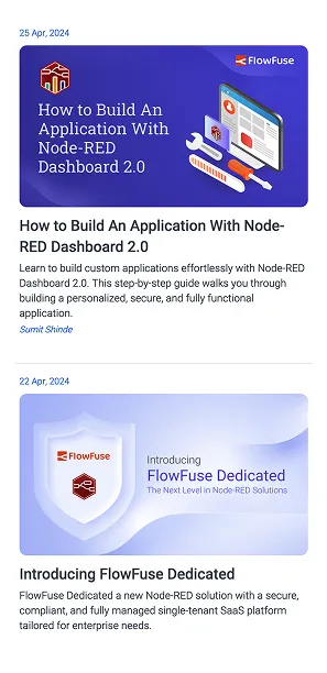
I worked across visual design and front-end implementation, translating design direction directly into production code.
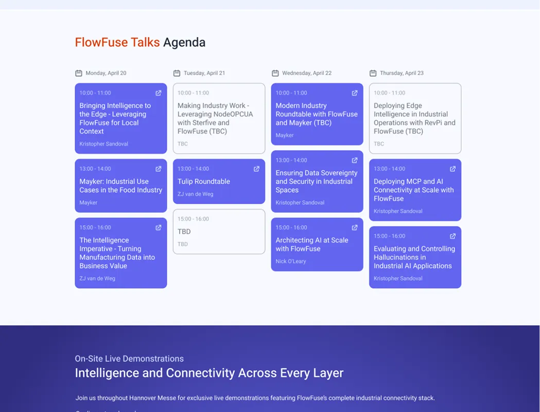
Working across design and front-end development reduced handoff friction and allowed me to maintain greater control over the final experience. I also developed reusable components and patterns to support new pages and frequent content changes without requiring a redesign each time.
- Figma
- Eleventy (11ty)
- Tailwind CSS
- JavaScript
- GitHub Copilot
<!-- Scalable Eleventy Component Architecture -->
<section class="grid grid-cols-1 md:grid-cols-12 gap-8 py-16">
  {% for feature in features %}
    <article class="col-span-4 p-6 rounded-lg bg-surface hover:shadow-md transition">
      <div class="w-10 h-10 rounded-full bg-secondary-fixed flex items-center justify-center text-secondary mb-4">
        {{ feature.icon | svgIcon | safe }}
      </div>
      <h3 class="font-headline-sm text-primary mb-2">{{ feature.title }}</h3>
      <p class="font-body-sm text-on-surface-variant">{{ feature.description }}</p>
    </article>
  {% endfor %}
</section>