01 / Overview
Building a Retail Brand
System from the Ground Up
- Role
- Visual & Brand Design Lead
- Scope
- Concept · Logo · Print & retail applications
Serendipia Descans is a furniture and homeware store built around a simple idea: offering something unexpectedly good. Beyond a carefully curated selection of products, the store provides personalized advice, furniture customization, and 3D room planning to help customers make confident decisions.
The challenge was to create a distinctive visual identity that communicated the owners’ vision: a more personal approach to comfort, design, and furnishing a home.
02/The opportunity
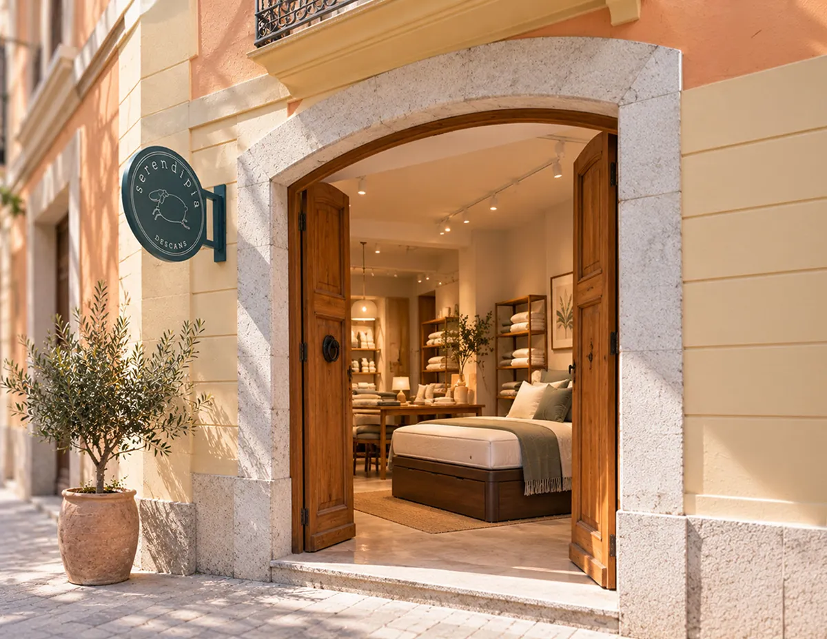
A different kind of furniture store
The owners wanted to stand apart from the furniture stores in their surroundings. Their vision combined comfort, carefully selected products, good taste, and personalized attention.
Starting with an established name and a clear idea of what made the business different, I translated that vision into a visual identity designed to feel welcoming, distinctive, and considered.
03/The concept
Familiar symbols of rest, reimagined
The name Serendipia evokes the pleasure of discovering something good when you least expect it. That idea became the starting point for an identity that needed to feel both approachable and distinctive.
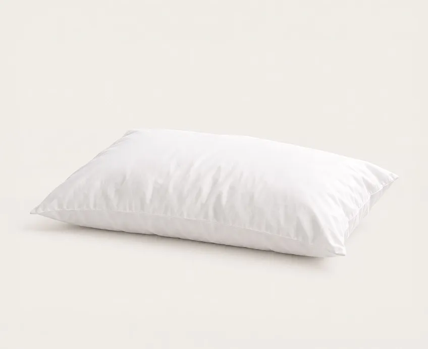
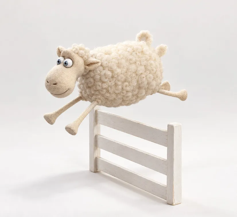
The name Serendipia evokes the pleasure of discovering something good when you least expect it. That idea became the starting point for an identity that needed to feel both approachable and distinctive.
04/Building the identity
A cohesive visual identity
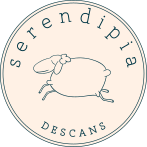
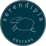
The identity combines a distinctive illustrated mark with carefully selected typography and a restrained color palette. Together, these elements create a visual language that balances warmth, clarity, and understated elegance.
The logo was explored through different compositions and typographic treatments to establish a clear hierarchy between the brand name, the symbol, and the Descans descriptor.



05/The identity in use
From the storefront to the customer’s home
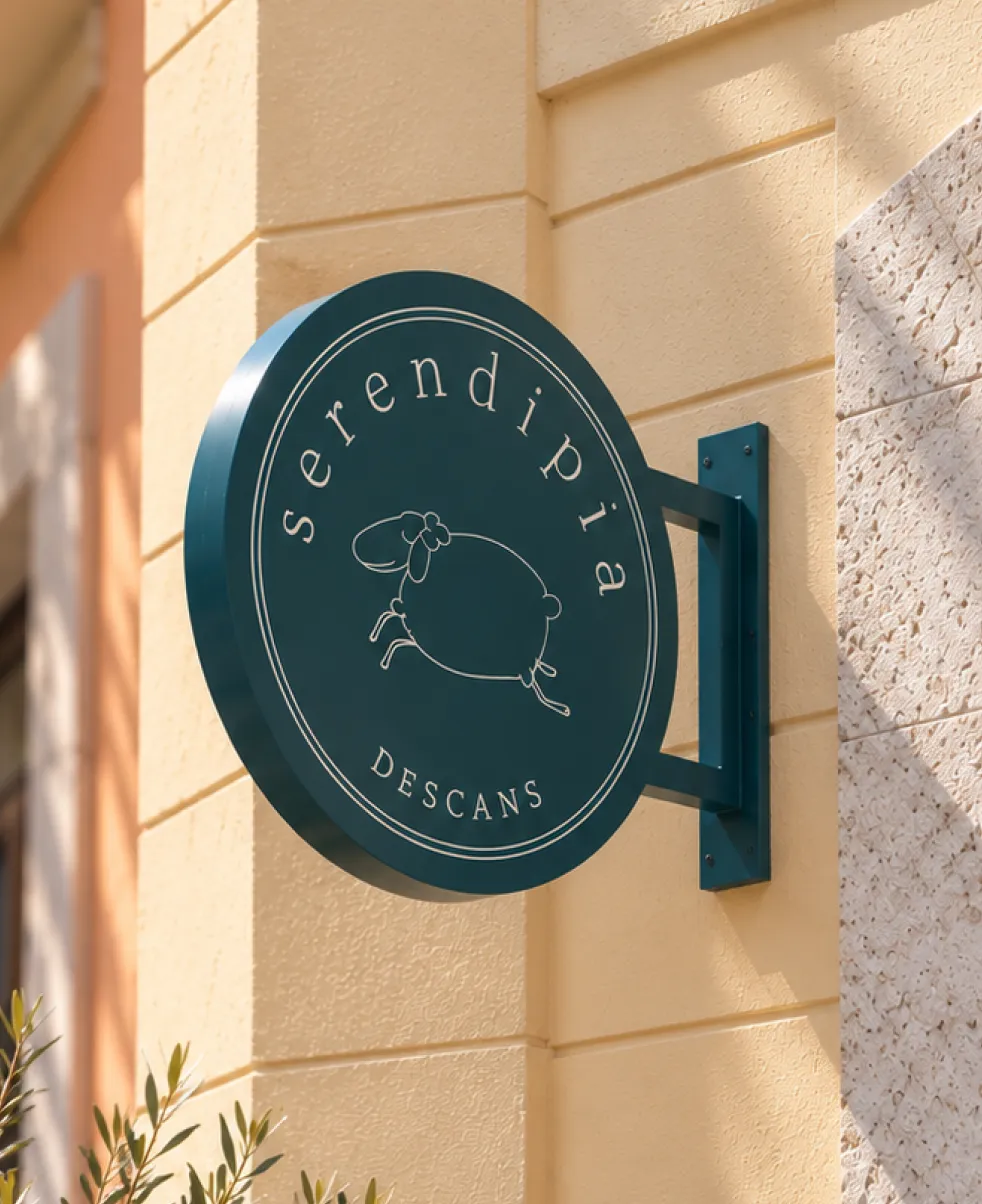
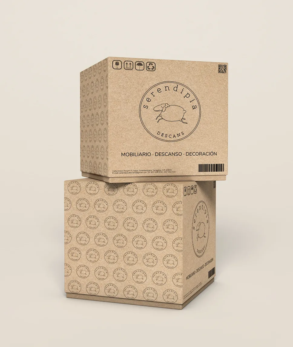
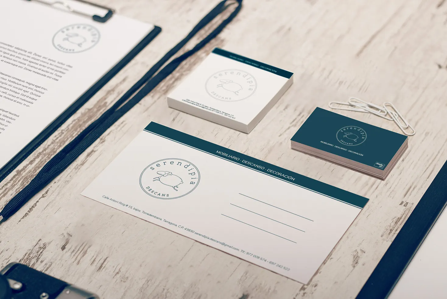
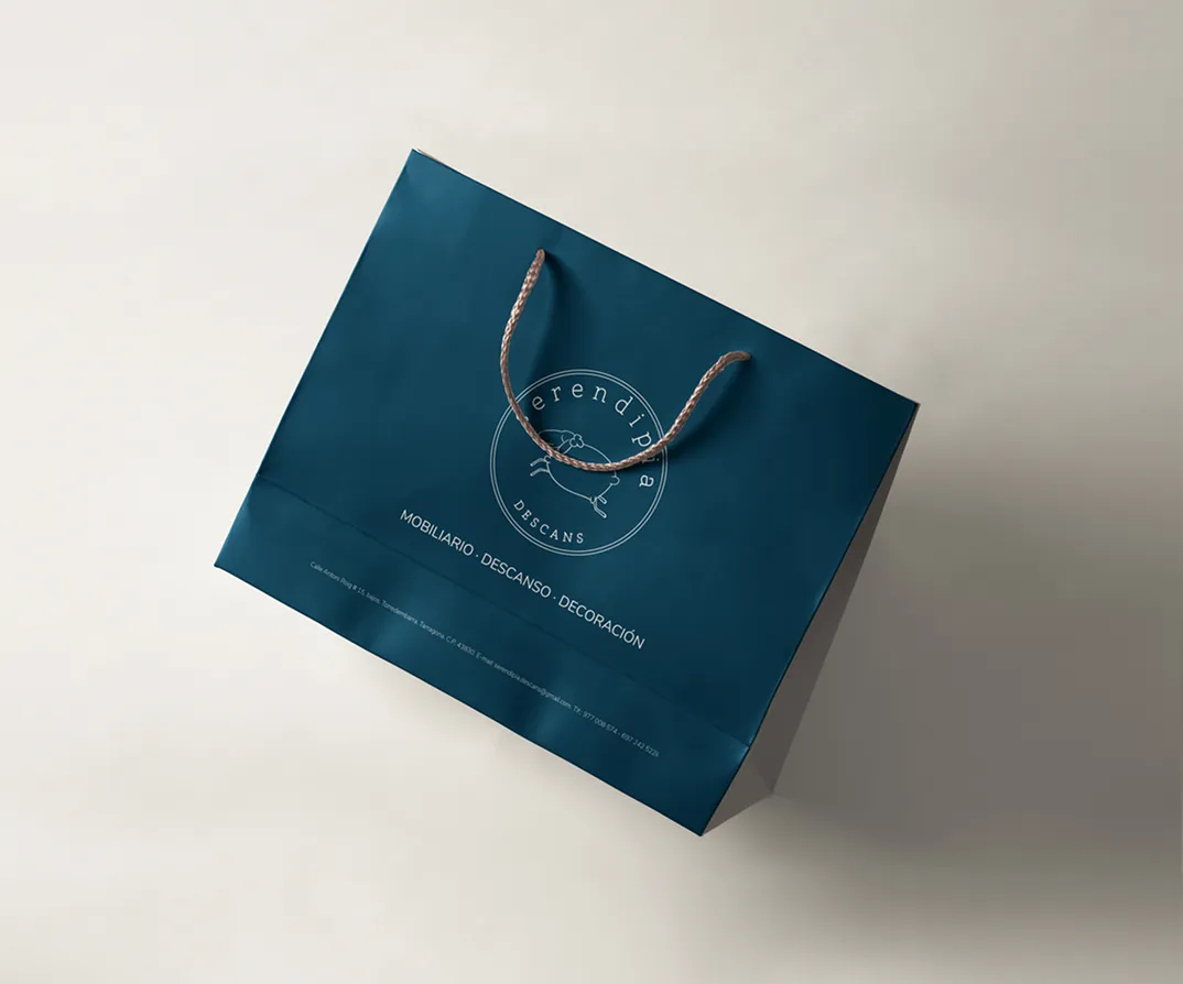
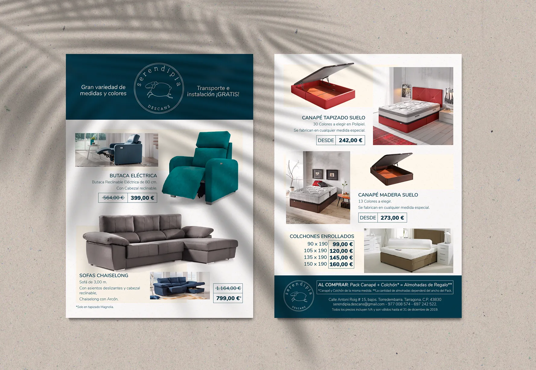
The identity was applied across physical and promotional materials, creating a consistent presence across different customer touchpoints.
From exterior signage to stationery, shopping bags, packaging, and promotional brochures, the visual language brings the brand together while adapting to different formats and uses.